The welcome screen is the first thing the user sees when launching the product installer. Welcome screens usually present general information about the product being installed and describe how the installer itself works. Simple enough, it would seem.
However, there’s one more thing of particular interest – the banner. In most cases you’ll find it to the left of the text. Each software manufacturer designs banners differently – while someone takes an extremely creative approach, others go with the logo or a screenshot of the app.
And what about AIMP banners?
In the early 2000s, installing an app was associated with purchasing and unboxing a physical product. Consequently, installers’ banners of that time demonstrated a “box” with the app’s CD. AIMP was not an exception:

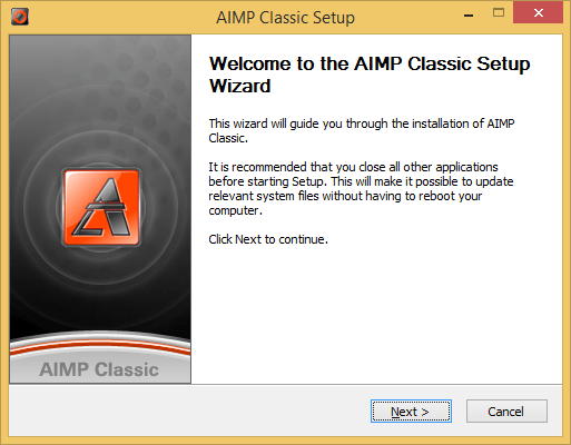
Then designer Sergey Ryumin joined the project in 2006. The banner became more beautiful and more abstract — just the product’s logo and name:
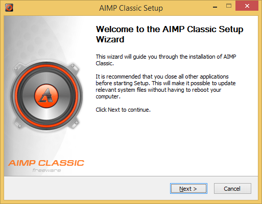
A bit later the banner evolved to reflect the idea of the app – a sound speaker with the AIMP logo on the dust cap:
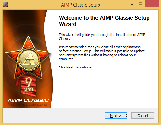
Around the same time we thought, why not design the banner to celebrate the day the release was scheduled for? Yeah, just like Google doodles!
For example, here’s the banner for the release of May 8:
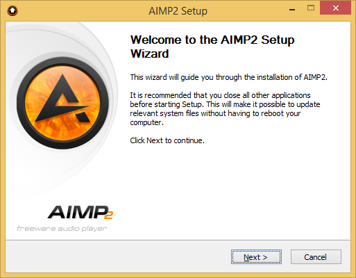
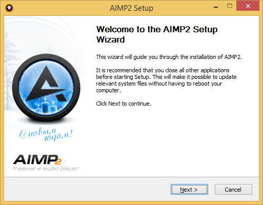
We continued the tradition in AIMP2:
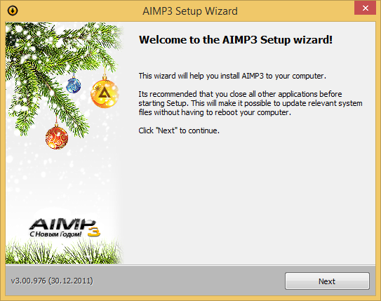
Our New Year banner:
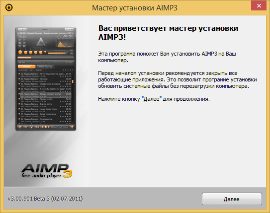
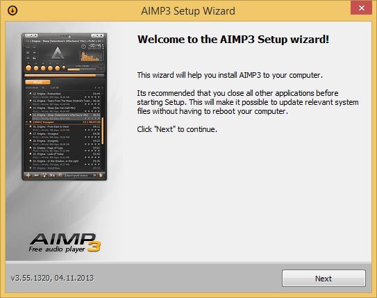
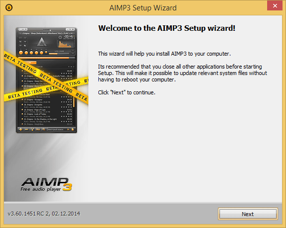
In AIMP3, the installer’s banner presented the app’s main window:
We updated the banner each time we tweaked the app’s skin:
Our special banners remained:
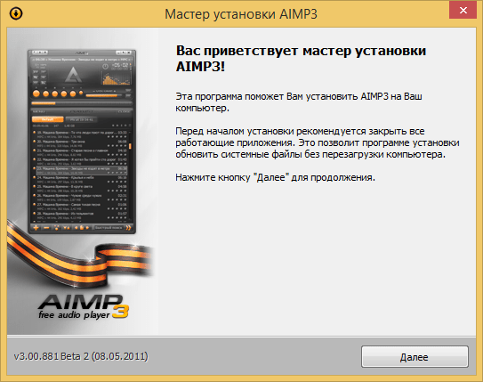
We even made some exceptions when preparing banners for some dates:
Then followed a design trend for minimalistic UI – software manufacturers started replacing 3D elements with flat ones, app windows lost redundant frames, variegated color themes were gone and new, simpler, themes with fewer colors were introduced. AIMP did not become an exception and followed the trend (Did we really have a choice there?).
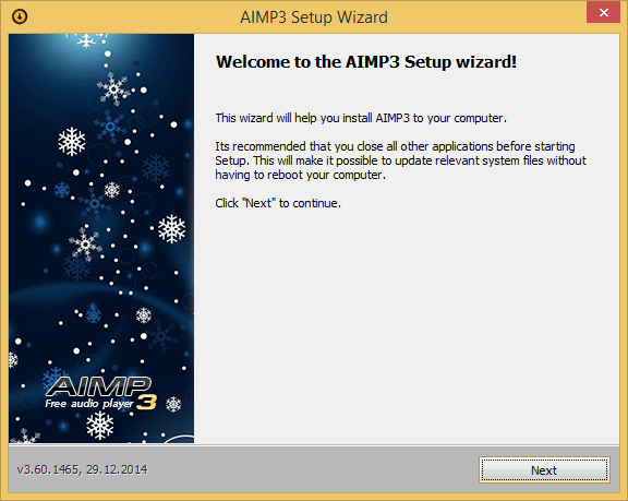
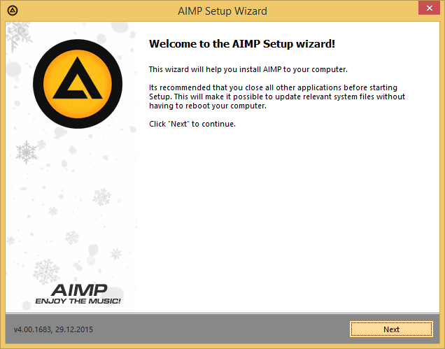
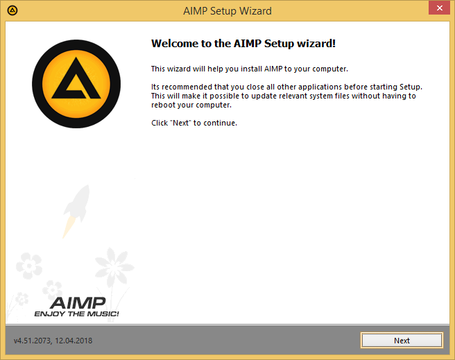
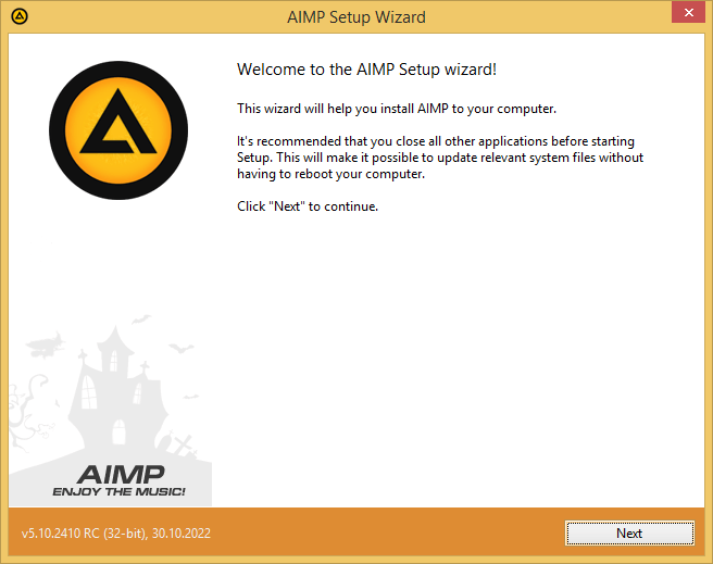
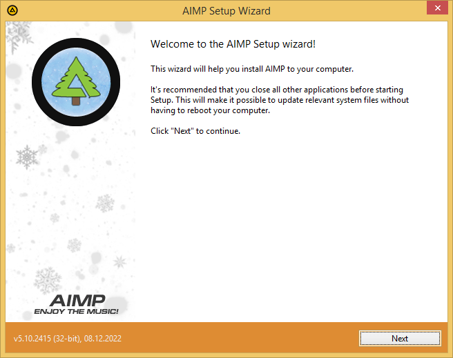
Starting with AIMP4, the banner did not stand out that much anymore and blended in with the installer’s background. The time of year when a particular version was released defined the pattern on the banner:


In 2017, it rained all through December, so, instead of a winter banner, we made a special version for this particular situation — torrential rain and puddles:

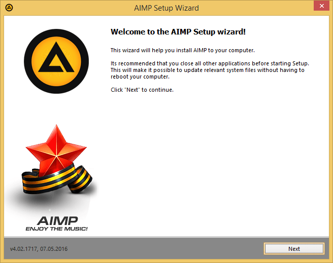
Celebration banners also remained:
For the Space Exploration day:
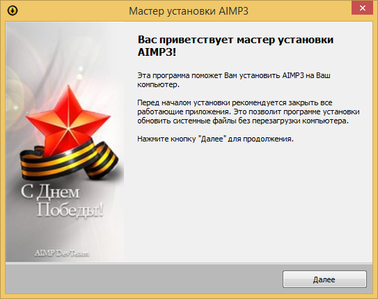
For the Labor day:
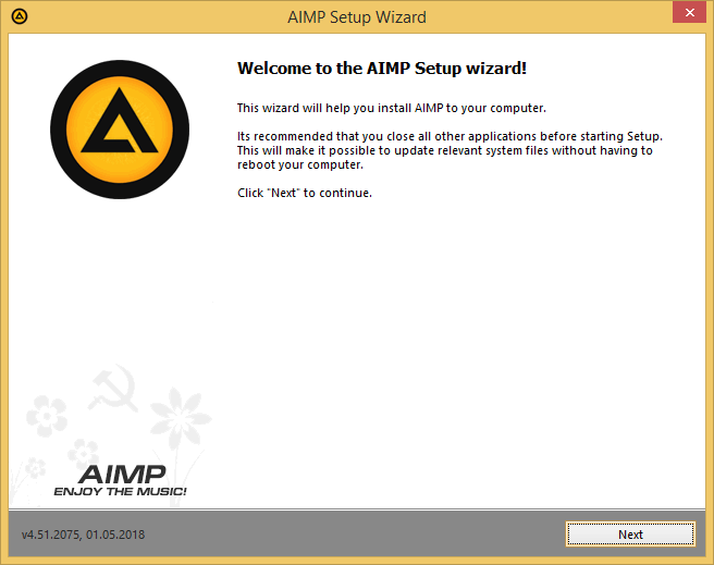
Later we learned that Soviet symbols are prohibited in some countries. We did not want to create problems for our users or ourselves, so we decided to abandon such special banners.
However, the idea of such banners is alive to this day:
What do you think about this? Do you enjoy seeing celebration banners? Are such things worth the team’s time and effort?
Merry Christmas and Happy New Year!
Интересно и креативно. Изюминка, которая не бросается в глаза. С автообновлением так и не успеваешь рассмотреть дизайн.
Думаю, что не стоит отказываться от этой традиции пока есть возможность создавать новое искусство.
Можно даже “пасхалку” добавить в сам плеер в окно о программе. На месте с названием программы разместить узкий фоновый баннер, который будет включаться на основе даты ПК.